DESIGN PROJECT

B2B Affiliate Tool Discovery

Educating affiliate partners on availability and usability of tools to increase utilisation and efficacy

Role

Product Design & Research

Industry

Technology

Duration

8 Weeks

Tools

Figma • Adobe After Effects • Adobe Illustrator • Condens • Looker • Hotjar

affiliate portal on computer screen

Context

The company Tiqets sells tickets to attractions and museums through their online booking platform. Tiqets works with affiliate partners to expand their reachable audience of end customers. The partners are provided affiliate tools which they can implement on their own websites and media to share the commissions earnt.

Defining the problem

The available tools were not being utilised by the affiliate partners. Tiqets wanted to increase utilisation and increase business performance from this.

Objectives

The objective was to deliver a more user centric experience, which educated the partners and made them feel more competent to use the tools available to them. The following objectives for the project were:

  • Create a better learning experience to engage and fulfil the learning needs of each partner and

  • Allow the user to feel more competent developing their business within the portal

Research

The project was driven by the following research methods:

Heuristic evaluation

This research showed that there was not any page nor content on the portal which effectively informed the user how to use the tools or where they might be used best. It was up to the user to click around and discover what a tool may do.

Benchmarking

Looking at how other platforms educated users gave insight into how in depth information went and what user flows worked best with delivering certain information. As a B2B platform, this is also triggered further research into educational methodolgy such as Pedagogy.

User interviews

This gave valuable insight into why users were not using the full selection of tools on offer and what there learning approach was when navigating the portal for the tools. Data showed that 100% of the users were not educated on at least one of the tools offered by Tiqets. All the interviews were conducted through Zoom as the partners were situated internationally and the raw data was analysed through a program called Condens to provide insghts.

Data analytics

Utilising Looker, quantitative data gave insight into where users went when logging into the platform. This was reinforced by utilising video observation clips from the program Hotjar. The observational and quantitative data showed that new users could well be looking for answers on tools to use but were less conclusive than the data obtained in the user interviews, meerly reinforcing the insights.

Insights from user interviews

Consolidated Inisghts into actionable items

Wireframing

Concepts and iterations to see how the information architecture would be structured. With a modular structure, it allowed for more rapid testing with users.

Wireframing

Concepts and iterations to see how the information architecture would be structured. With a modular structure, it allowed for more rapid testing with users.

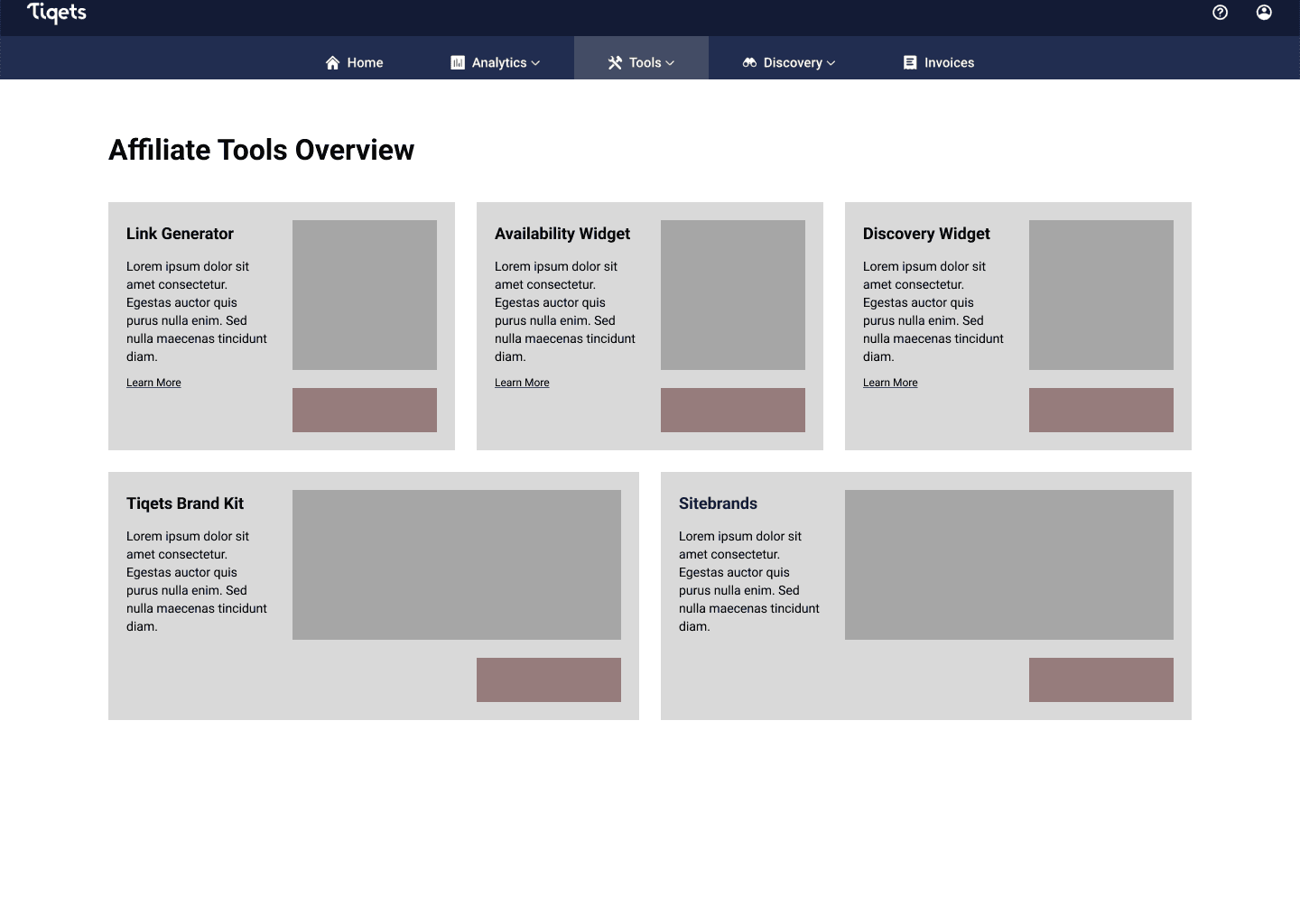
Initial design was in a bento box style to give the user an overview without giving cognitive overload and allowing flexibility in design.

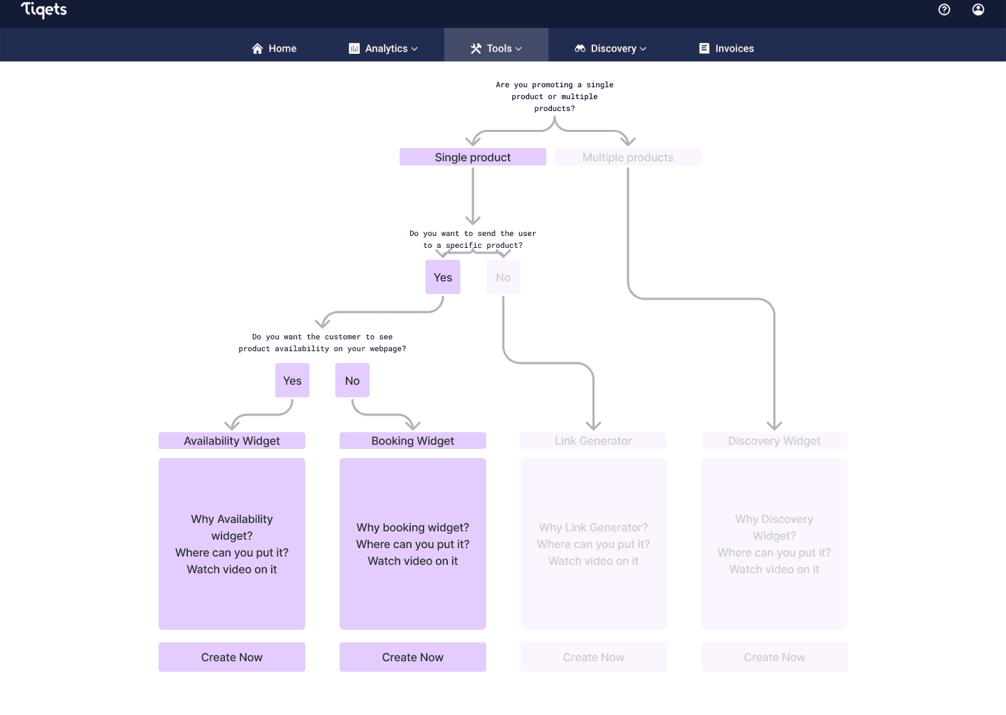
Exploration moments when iterating brought different designs such as a decision tree approach. This design was not chosen as there were only four tools and having a deciison tree approach was unnecessary for a relatively easy decison making process.

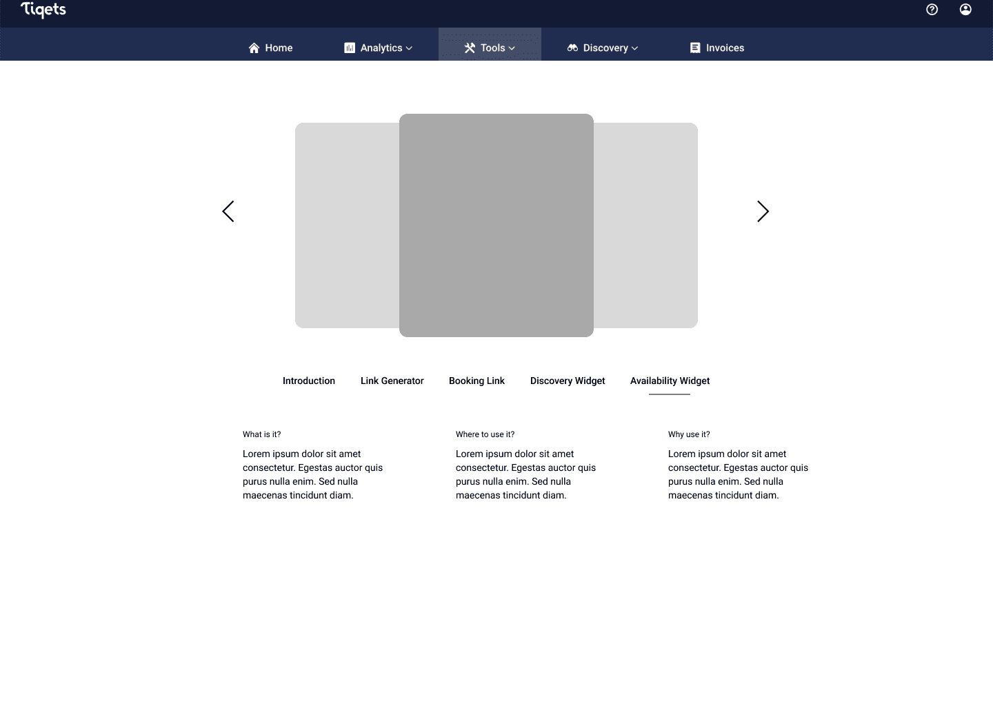
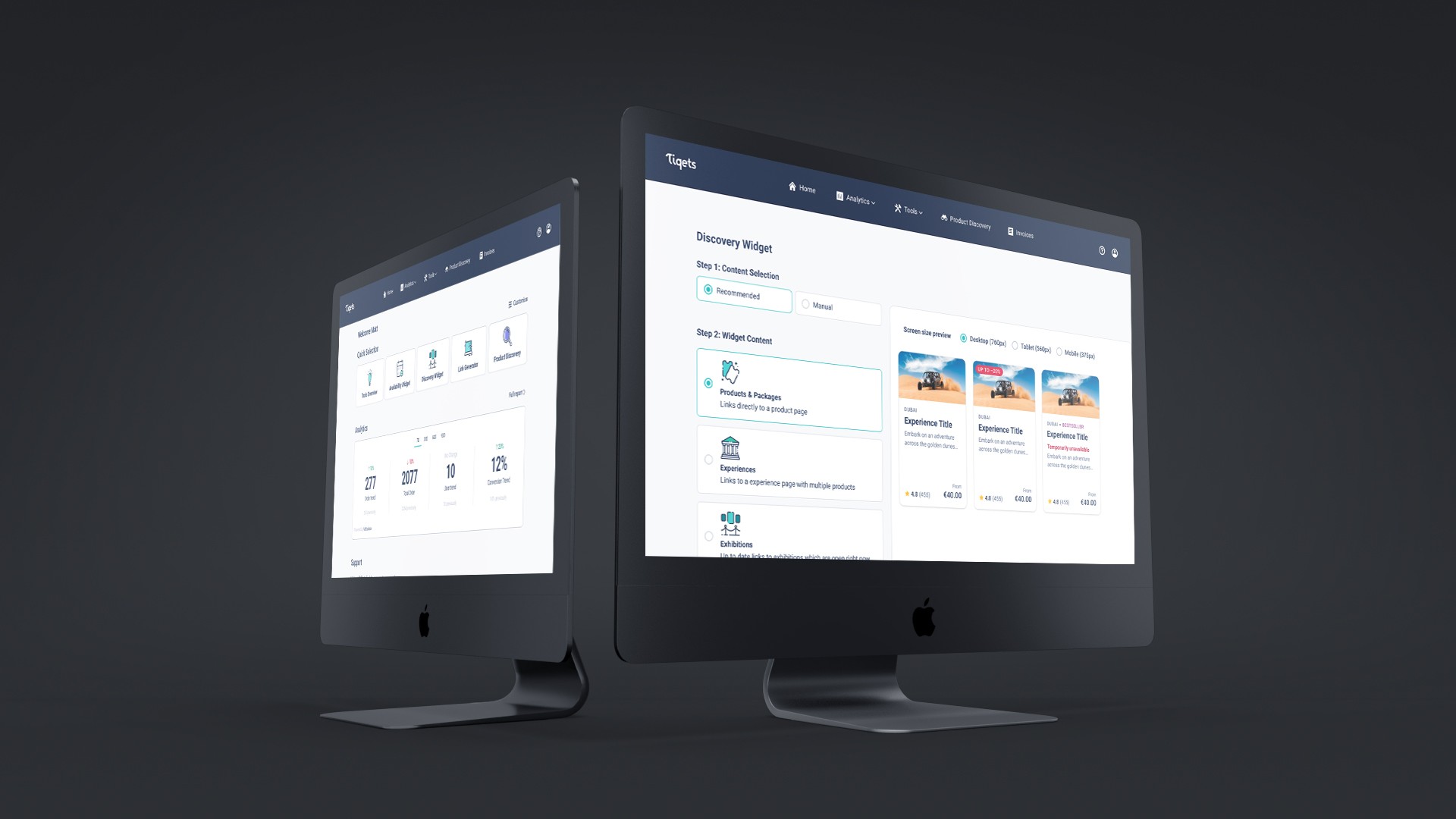
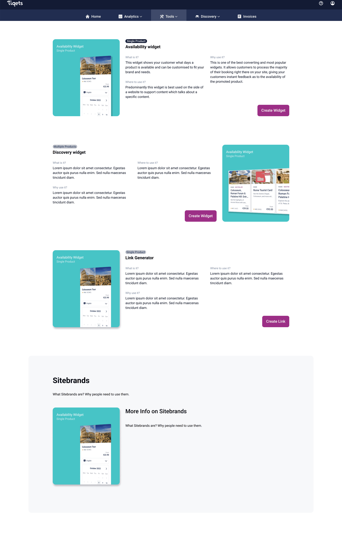
A carousel approach gave the user focus on a single tool and allowed for more information to be present on this tool. By reducing the amount of content on screen, the intention is to better inform the user in a calmer space. This was explored further in HiFi designs.

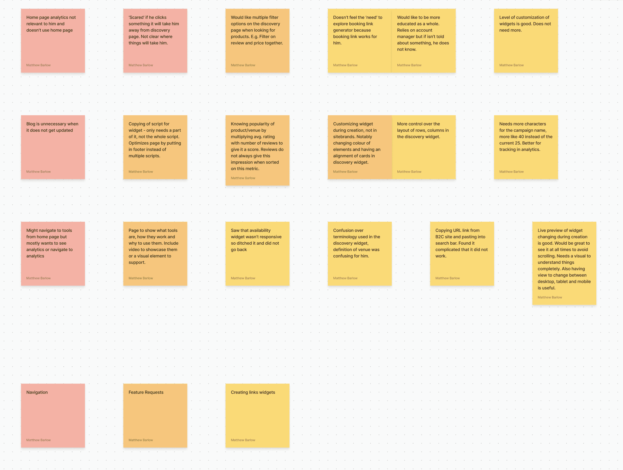
Working with the concept of providing more information, a stacked approach was also wireframed. Providing more information to user came from user interviews who requested certain infromation to be informed.

High Fidelity Iteration

Using Figma, the HiFi prototypes were crucial to showing how the engagement and interactive side of the learning process could be integrated.

High Fidelity Iteration

Using Figma, the HiFi prototypes were crucial to showing how the engagement and interactive side of the learning process could be integrated.

Taken from the wireframes, this idea was explored and rapid tested. Testing saw that users were unaware text information was changing and viewport size could cause issues with seeing this. Seeing the tool was a big benefit, as was the interactive element to the carousel.

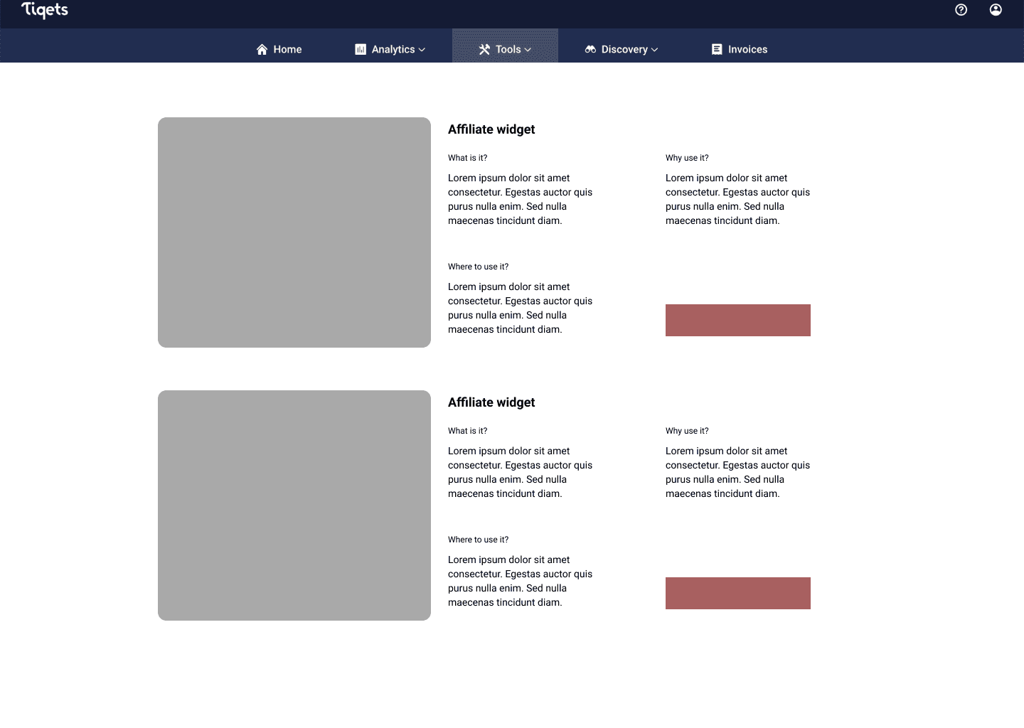
Created a more tabular approach with the tool information situated to the side for clearer recognition of changing information. Space and constriction of elements started to make it feel busy and overwhelming which is why the tabular idea was not taken forward in the design process.

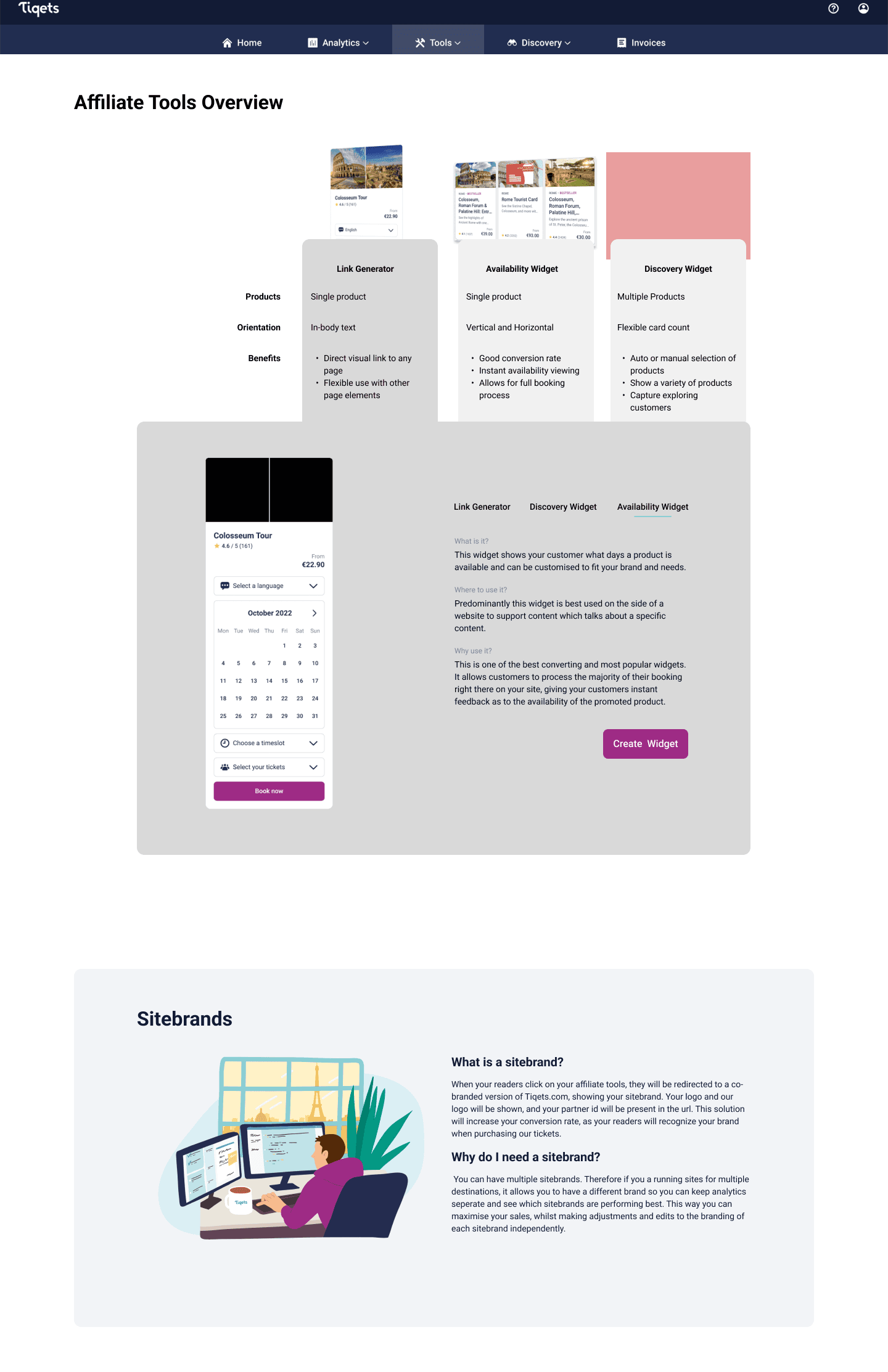
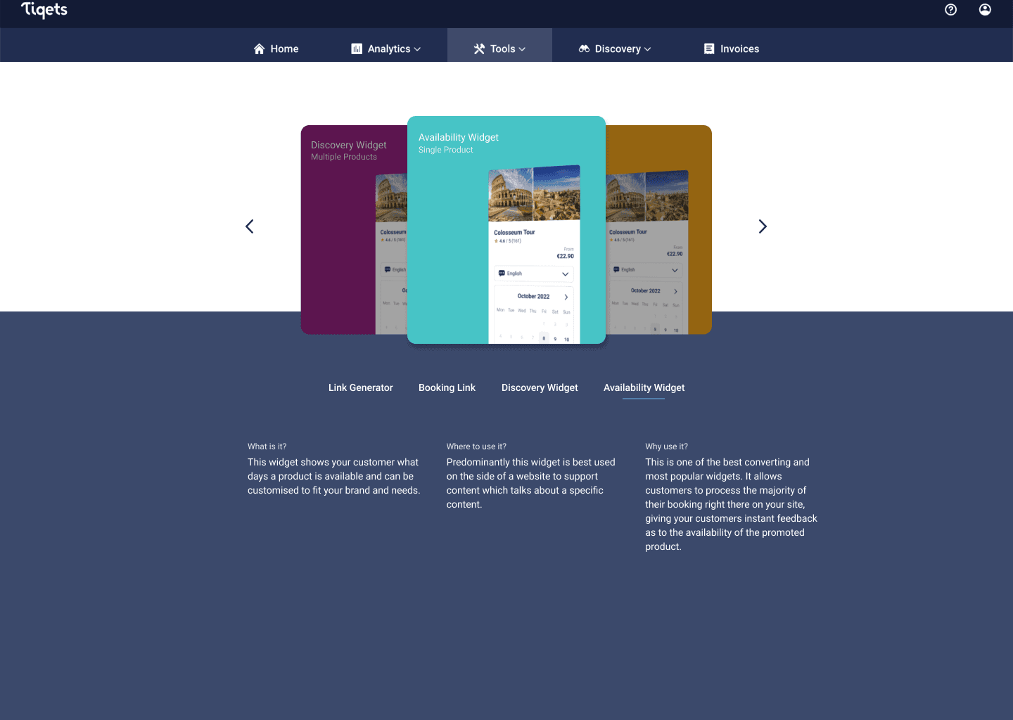
Started to explore the idea of high level and low level information based off of research in user interviews. A comparison concept came in to satisfy user insights for efficiency in decision making whilst a detailed panel allowed for more cognitive users to absorb the details, but this information was still hidden.

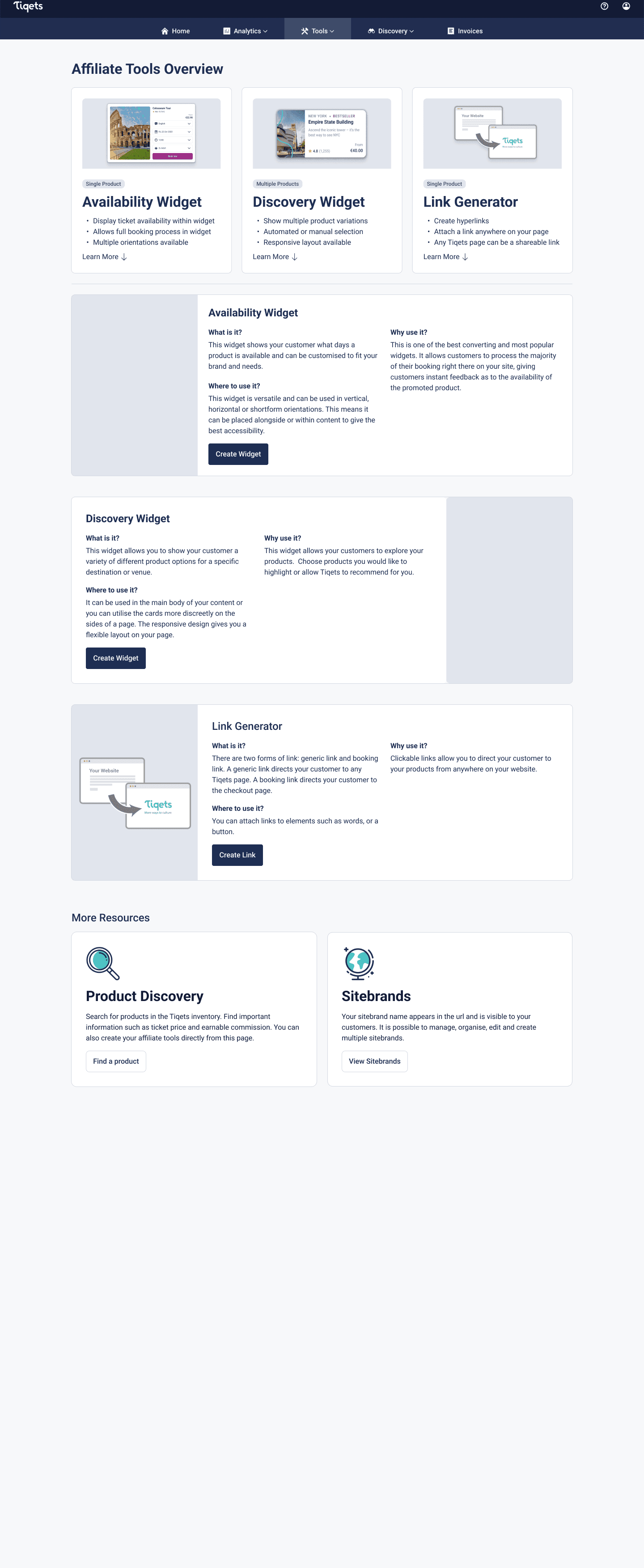
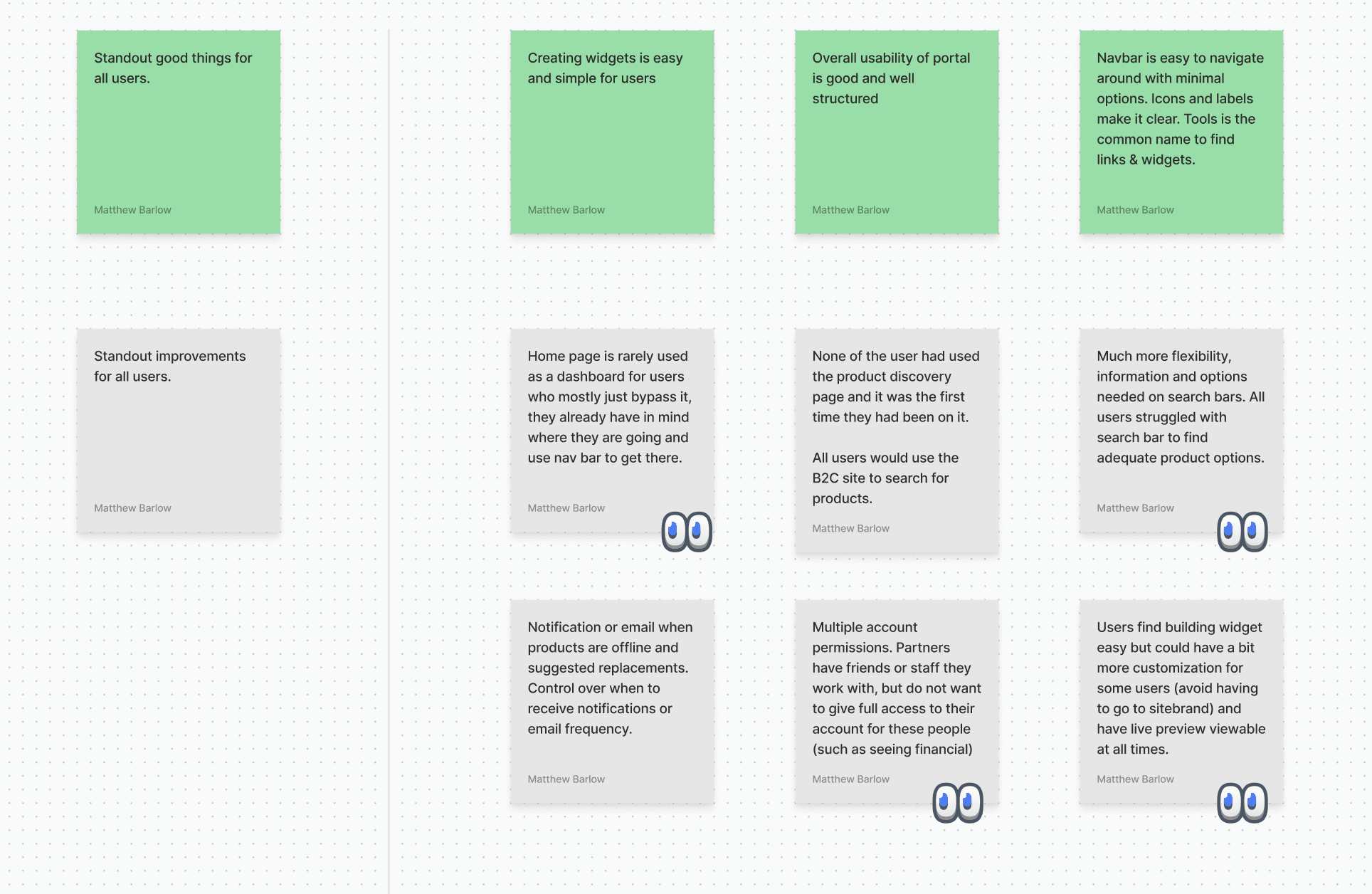
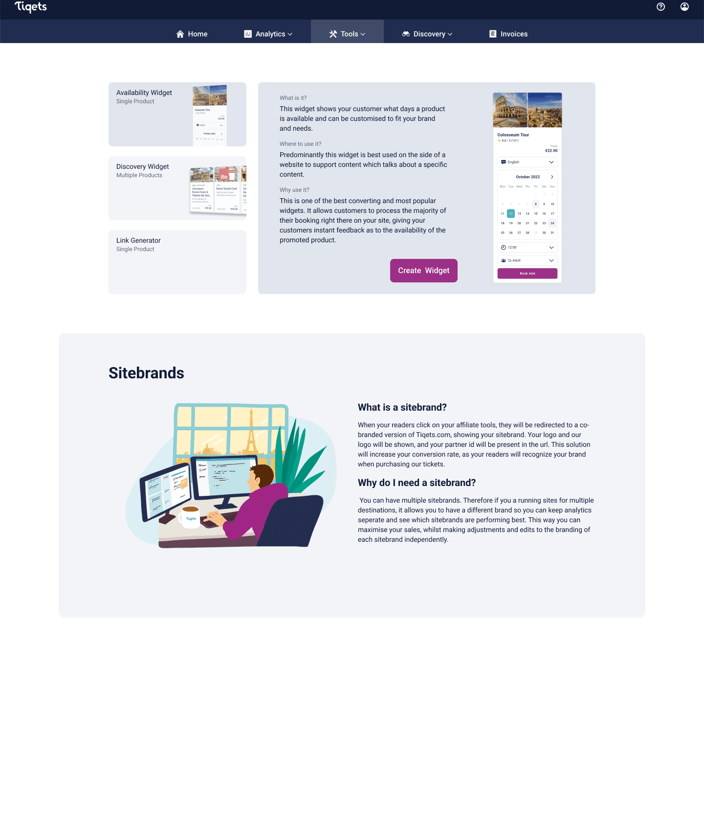
A stacked approach as explored in wireframing was utilised more, whilst the decision to absorb one toll into another reduced the choicing. This idea was the strongest due to witnessing user scrolling behaviour in Hotjar and allowing for a structured design that was easy to use.

Motion Graphics

Using motion graphics for visual interaction, it allows the user to see the flexibility and use of the tools.

Motion Graphics

Using motion graphics for visual interaction, it allows the user to see the flexibility and use of the tools.

User Feedback & Refinement

User testing was conducted with users who were new to the affiliate tools to see how the newly implemented changes worked for learnability of the new page. Results showed positive results in the structure of information and how it was presented. The motion graphics were the biggest success with users commenting that it was good to see the "flexibility of the tool" and it "made the page feel more alive". Improvements were made to the UX copy to make it more concise and action orientated so it was clear to users which actions the tools would help them most.

Raw Data Quote

'But I do think it looks very nice, like the flow of it, and you can see the amount of customization and I think that's it's kind of fun looking.'

Raw Data Quote

'I mean, I feel like this is informative and answers the questions I would have'

Outcomes

  1. Qualitative testing showed users feel more competent to use the partner tools and analytics showed active engagement with users clicking through to the tools overview page at launch.

  2. User feedback also gave very positive remarks for the level of information, appreciating the high level and low level information, whilst also appreciating having visual elelements like the motion graphics to see what is being described.

Final Screens

Designs implemented onto the B2B affiliate portal to improve users knowledge of the tools offered.

Final Screens

Designs implemented onto the B2B affiliate portal to improve users knowledge of the tools offered.

Final design of affiliate tools overview page

Reflection

This was an extremely insightful project to dive deeper into engaging users with an educational motive, whilst encompassing the design process in a B2B mindset. It developed my ability to empathise with business owners needs further, whilst taking into consideration other stakeholders such as end customers.

With more rapid user testing throughout the project, it may have streamlined the initital design process and validated some of the design directions quicker. By navigating resources better, this probably would have been achieveable. Ultimately the end design achieved what it set out to do, and despite time and resource restrictions in the research phase, users have greater knowledge in the tools offered.

Other projects

Interested in connecting?

Let’s talk projects, collaborations, or anything design!

Interested in connecting?

Let’s talk projects, collaborations, or anything design!

Interested in connecting?

Let’s talk projects, collaborations, or anything design!

Copyright 2024 by Matt Barlow

Copyright 2024 by Matt Barlow

Copyright 2024 by Matt Barlow